How to Use Krea 2 AI Image Generator
A step-by-step guide for creators who want aesthetic, style-controlled images — write content prompts, transfer a look with reference images, and build moodboards for a consistent universe, all in the browser.
What Is Krea 2? Features, Workflows, and Prompt Tips
Krea 2 is an aesthetic-first AI image generator from Krea AI, built for creating images with stronger control over composition, lighting, color harmony, and style consistency. You can create images from text prompts, guide the look with uploaded style references, and choose between Krea 2 Medium for expressive illustration or Krea 2 Large for photorealistic detail and raw camera-style looks.
This guide shows you how to use Krea 2 in real workflows: creating images from text prompts, using Style Reference to guide the look with uploaded images, and building moodboards to keep a consistent visual direction. You will also learn prompt formulas, style and lighting vocabulary, when to choose Medium or Large, and the common mistakes that make AI images look generic — whether you are creating portraits, product shots, illustrations, or concept art.
Step 1 — Open the Generator
Open the generator
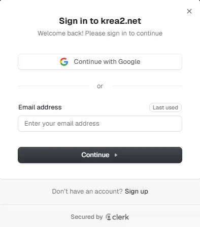
Open the Krea 2 generator from the navigation and sign up if you have not already — new users get 50 free credits, enough to try a handful of images across both variants.
Pick a mode
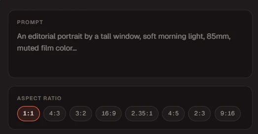
Choose Text to Image to create from a written prompt, or Style Reference to guide the result with uploaded images. You can combine the two: a content prompt plus references.
Plan a short first test
Start on Krea 2 Medium at a lower creativity level to find a direction cheaply, then switch to Large or raise creativity once the composition is working.
For the fastest start, open the Krea 2 generator with one short prompt, generate a small batch, then adjust only the setting that changes the result you care about.
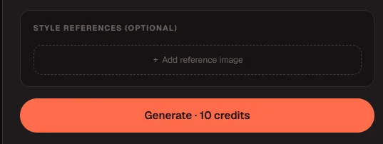
Credit tip: Krea 2 Medium costs 10 credits per image (15 with a style reference) and Large costs 15 (20 with a reference). Start on Medium to explore cheaply — the Krea 2 pricing page shows how credit packs map to image counts.
Step 2 — Text to Image: How It Works
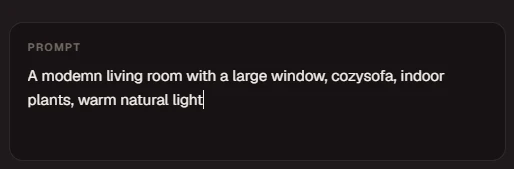
Text to Image is the primary mode for generating from scratch. You describe the image you want — subject, scene, lighting, mood — and Krea 2 composes it. A strong content prompt follows this formula:
Prompt Templates You Can Copy
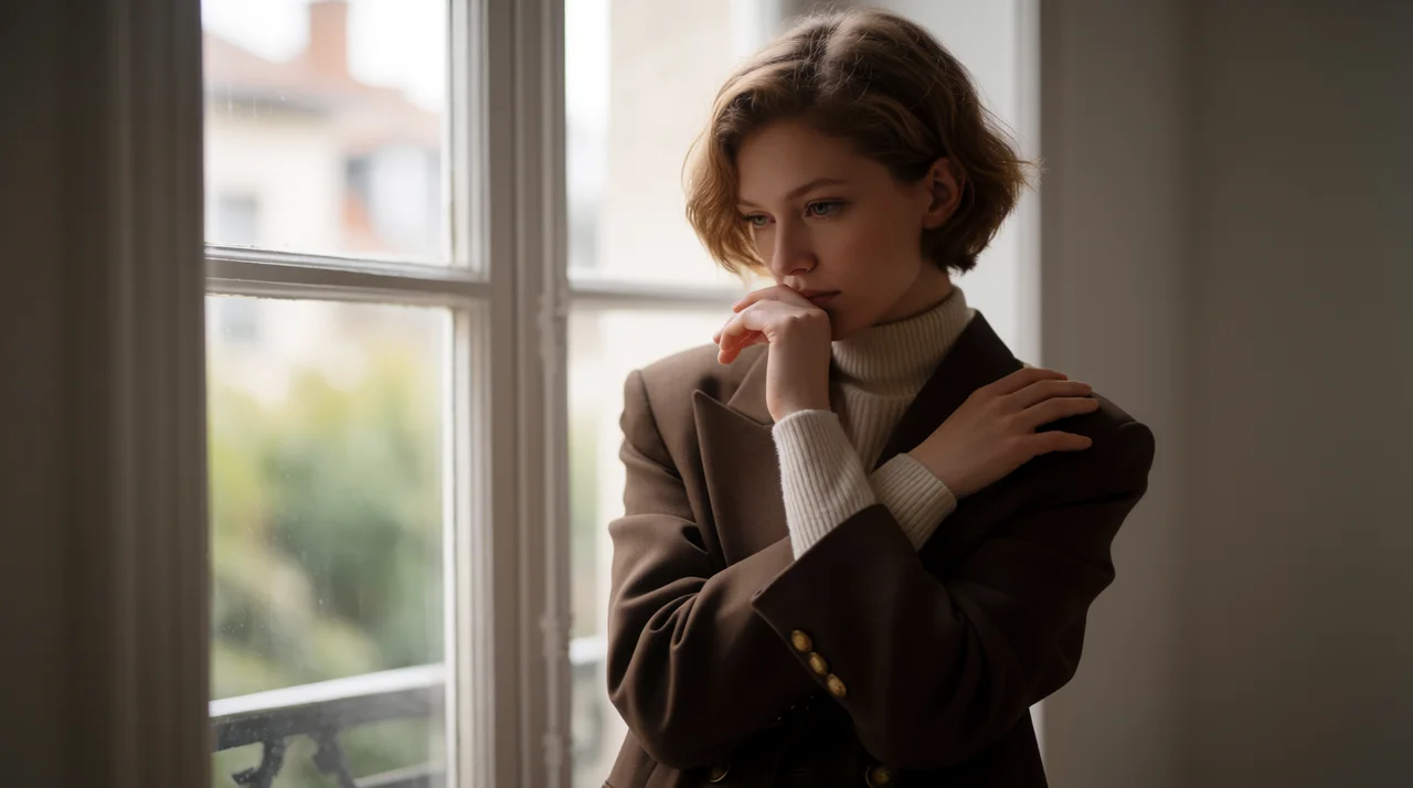
"An editorial portrait of a woman by a tall window, soft morning light, shallow depth of field, 85mm, muted film color, calm mood, photographic."
Try this prompt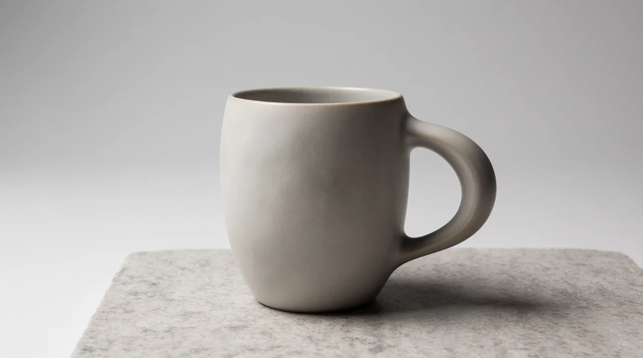
"A matte ceramic coffee mug on a stone surface, studio softbox lighting, clean seamless background, crisp focus, commercial product photography."
Try this prompt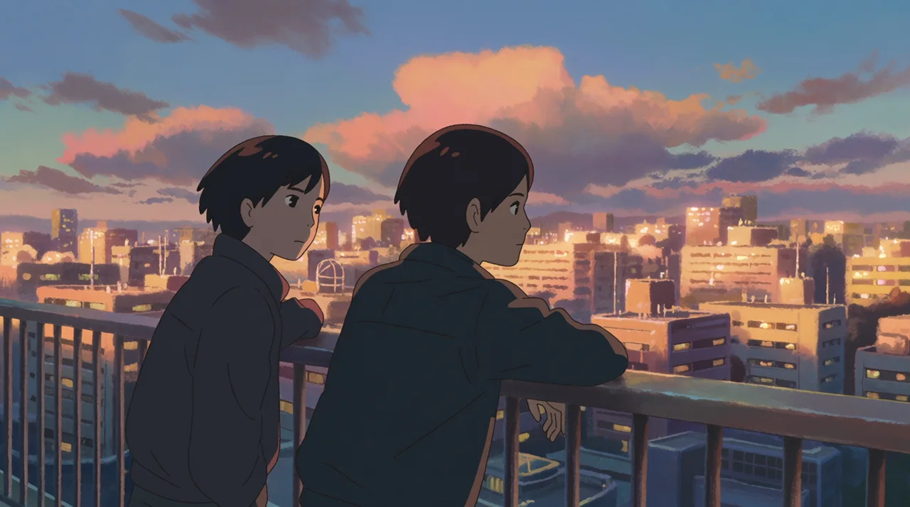
"An anime rooftop scene at dusk, two friends watching city lights, cel shading, warm rim light, nostalgic mood, detailed background illustration."
Try this prompt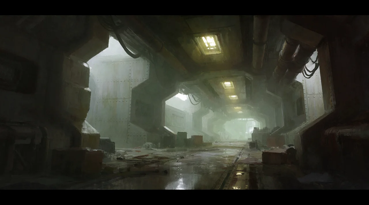
"Concept art of a derelict space-station corridor, volumetric haze, emergency lighting, wide cinematic framing, gritty sci-fi mood, painterly detail."
Try this prompt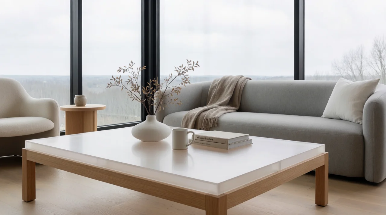
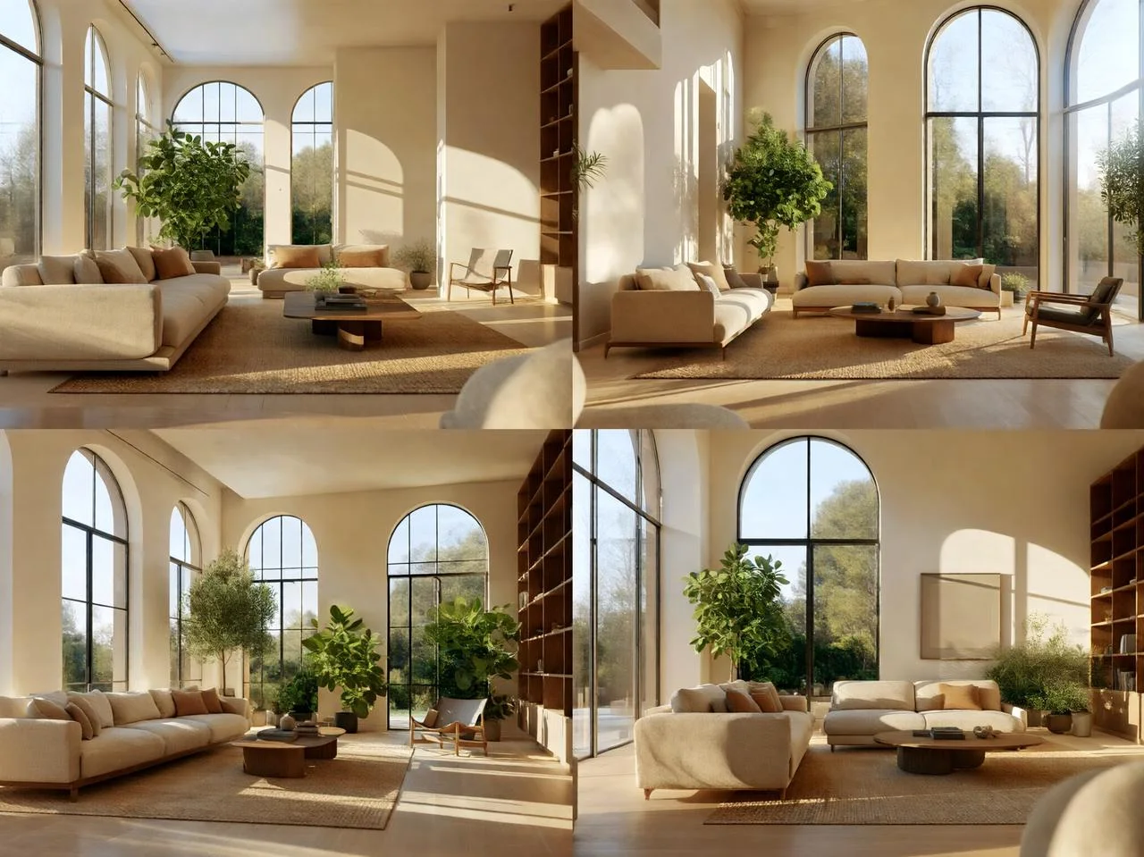
"A minimalist Scandinavian living room, large windows, soft overcast daylight, warm oak floor, calm editorial mood, architectural photography."
Try this promptStep 3 — Style References: Match a Specific Look
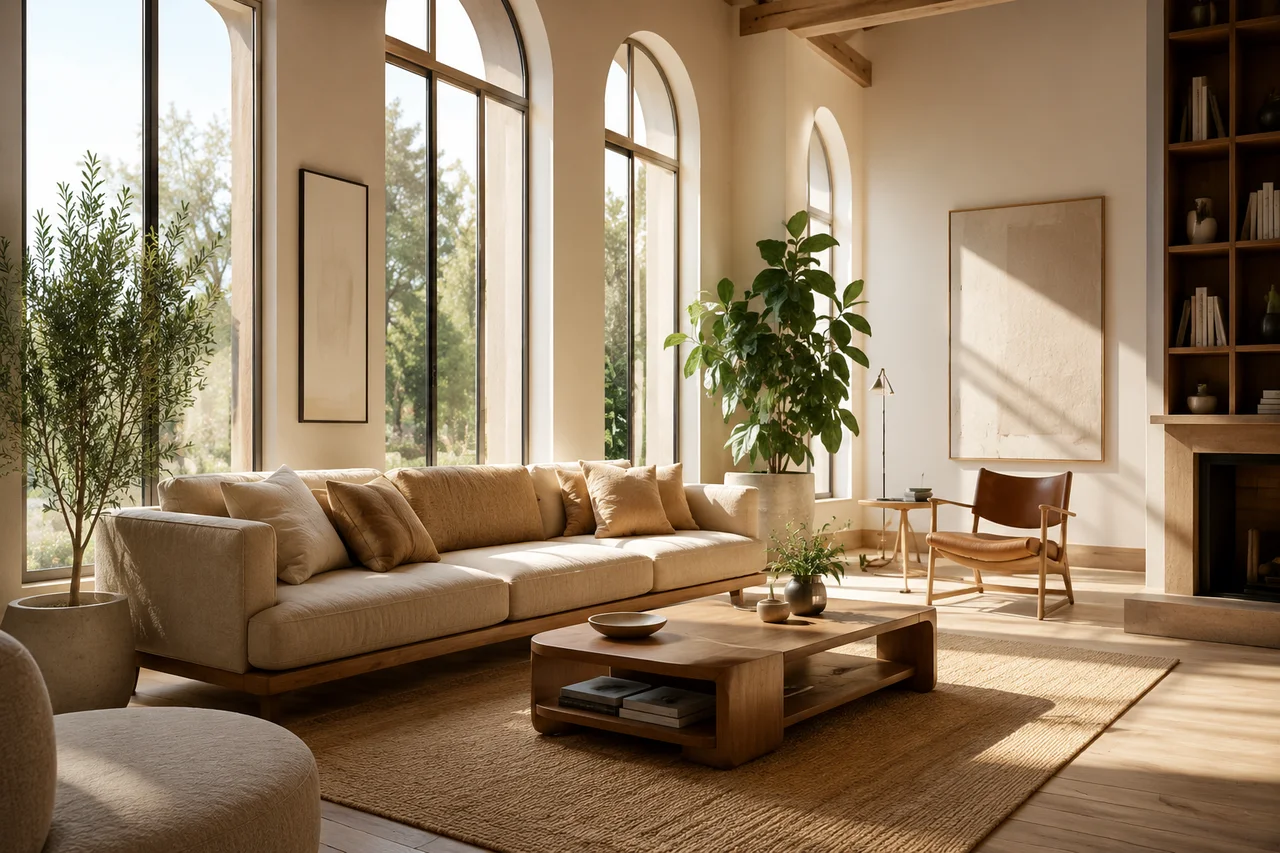
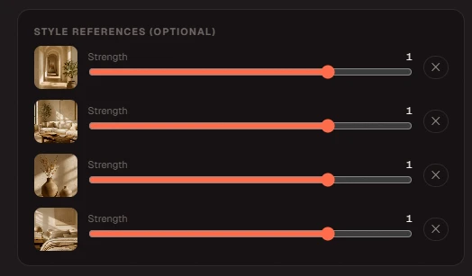
Style References let you upload images so Krea 2 transfers their look to your generation. Describe the content in the prompt and let the references carry the aesthetic.
Choose a clear reference
Pick reference images that carry the look you want — palette, texture, lighting. A clean, cohesive reference transfers more predictably than a busy collage.
Set per-reference strength
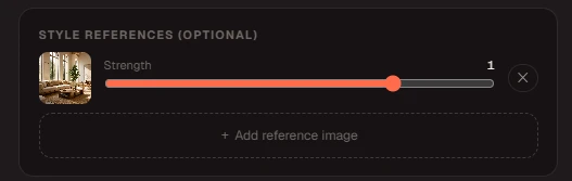
Add one or a few references and dial each one's strength. Higher strength pulls harder toward that look; lower keeps it as a subtle influence.
Write a content prompt, not a style prompt
Describe the subject and scene in words and let the references carry the aesthetic. Stacking style adjectives on top of a strong reference usually muddies the result.
Blend and compare
Combine references at different strengths and generate a few variations to find the balance between your prompt and the borrowed look.
Step 4 — Moodboards: Lock a Visual Universe
A moodboard is a collection of images Krea 2 analyzes into a taste profile, style keywords, and things to avoid — then applies to every generation in that board. It is the fastest way to keep a series consistent.
Assemble a cohesive board
Gather images that share a taste — palette, era, texture, mood. Conflicting styles weaken the profile Krea 2 extracts from the board.
Let Krea 2 read the board
Krea 2 analyzes the board into a taste profile, style keywords, and things to avoid, then applies that direction under the hood on every generation in the board.
Generate inside the universe
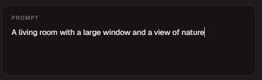
Write ordinary content prompts; the moodboard keeps palette and style consistent across the whole set without re-describing the look each time.
Refine the board, not every prompt
If the look drifts, add or remove a couple of board images instead of rewriting prompts one by one. The board is the single control for the series.
Step 5 — Generator Settings
| Setting | Options | When to use |
|---|---|---|
| Mode | Text to Image / Style Reference | Text to Image creates from a written prompt. Style Reference guides the generation with uploaded images. Combine both for the most control. |
| Model | Medium / Large | Krea 2 Medium for fast, expressive illustration and anime. Krea 2 Large for photoreal detail and raw looks like grain and motion blur. |
| Aspect ratio | 1:1 · 4:5 · 3:2 · 16:9 · 2.35:1 · 9:16 | Match the frame to where the image will be used — a feed post, a poster, a thumbnail, or a cinematic banner — before you generate. |
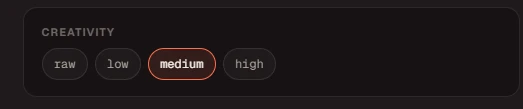
| Creativity | raw / low / medium / high | Lower stays faithful to the prompt and references; higher reinterprets more freely. Lower for product accuracy, higher for concept exploration. |
| Reference strength | per-image, low → high | Controls how strongly each reference's style applies. Start near the middle and adjust up or down per reference. |
Step 6 — Style and Lighting Vocabulary
Style & Medium Vocabulary
Lighting & Mood Words That Shape the Image
Step 7 — How to Iterate for Better Results
Look before rewriting
Review the output and identify the weakest element first — composition, lighting, or style. Don't rewrite the whole prompt when only one variable needs tightening.
Change one variable at a time
Adjust creativity, one reference, or one prompt clause per pass so you can tell what actually improved the result.
Preserve what works
Keep the prompt phrases and references that produced strong elements. If the lighting is right but the style is off, change only the style cues.
Save successful setups
When a prompt, reference, and variant combination works, save it as a template for similar future images.
Common Mistakes and How to Fix Them
| Problem | Likely Cause | Fix |
|---|---|---|
| Prompt is all style words | Describing the look instead of the content while using references. | Write a content prompt — subject and scene — and let the references carry the style. |
| Reference strength too high | A single reference overpowering the prompt and flattening the result. | Lower the strength, or blend a second reference to balance the look. |
| Wrong variant for the goal | Using Medium for photoreal detail, or Large for flat illustration. | Pick Medium for expressive/illustration and Large for photoreal/raw looks. |
| Aspect ratio doesn't fit the use | Generating a square image for a widescreen banner or vertical story. | Choose the aspect ratio that matches the destination before generating. |
| Conflicting moodboard images | Mixing incompatible styles dilutes the taste profile Krea 2 extracts. | Keep the board cohesive and remove outliers that pull in another direction. |
| Trademarked or copyrighted references | Uploading brand logos, characters, or photos you do not have rights to use. | Use reference images you own or are licensed to use, and keep prompts free of protected IP. |
FAQ
Questions About Using Krea 2
How do I start using Krea 2?▼
Open the generator, choose Text to Image or Style Reference, write a content prompt, pick an aspect ratio and creativity level, choose Krea 2 Medium or Large, and generate a quick test. Start simple, then refine by adjusting references and creativity.
What is the best prompt structure for Krea 2?▼
Use the formula subject + scene + composition + lighting + mood + medium/style + technical detail. Describe the content of the image, and let style references or a moodboard handle the look rather than piling on style adjectives.
Should I use text-to-image or style references?▼
Use Text to Image when you are starting from a description, and Style Reference when you have a specific look to match. Combining a content prompt with one or two references usually gives the most control over the result.
How many reference images can I use?▼
You can add several references and set each one's strength individually. Start with one or two strong references rather than many weak ones — it is easier to control how the final image looks.
When should I use Krea 2 Medium versus Large?▼
Use Krea 2 Medium for fast, expressive work — illustration, anime, and painting. Use Krea 2 Large for photorealism and raw looks such as film grain, motion blur, and low dynamic range. Pick the variant that matches the image you need.
What does the creativity level do?▼
Creativity balances how closely Krea 2 follows your prompt and references against how freely it reinterprets them. Use lower creativity for faithful, product-accurate images and higher creativity for open concept exploration.
How many credits does a generation cost?▼
Krea 2 Medium costs 10 credits per image, or 15 with a style reference. Krea 2 Large costs 15 credits, or 20 with a reference. New accounts start with 50 free credits, and the pricing page shows how packs map to image counts.
Can I reuse prompt templates?▼
Yes. Keep the formula structure and swap the subject, scene, lighting, and references. Reusing a strong template is one of the fastest ways to get consistent results across a series of images.
Ready to Generate Your First Image?
Open the Krea 2 AI Image Generator and create from a text prompt, transfer a look with style references, or build a moodboard for a consistent series.
Start Generating Free →